Designing a Digital Presence for Traditional Marble Temples

Client's Background
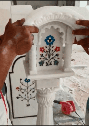


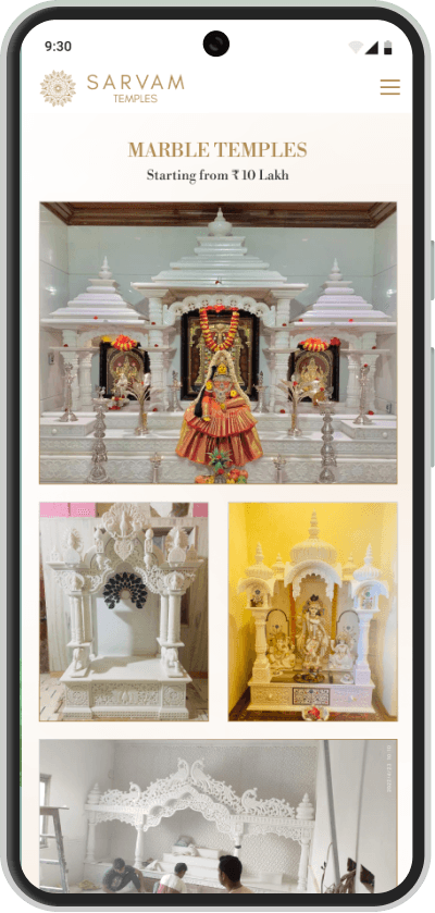
A glimpse into the intricate craftsmanship that brings every temple to life. ✨
They specialise in crafting luxurious marble temples, with high-quality craftsmanship and materials, including globally sourced marbles like Makrana, Italian, and Vietnamese.
End-to-end service: from design to delivery and assembly, ensuring a seamless experience.
Safe, secure delivery with shock-proof packaging to protect your temple.
The client was an offline marble temple carving business catering to high-end clientele while maintaining its deep connection to cultural and spiritual heritage. Leveraging generations of craftsmanship combined with modern materials and finishes, their goal is to provide not only beautiful temples but a trustworthy and comprehensive service, from customisation to delivery, ensuring the highest satisfaction for their customers.
Task 1 : Building Brand (Logo Designing)
Design a modern logo inspired by cultural heritage and spiritual symbolism.
Ensure brand consistency across digital platforms and the portfolio.
Create a luxurious and refined visual identity for high-end clientele.
The task involves crafting a logo that seamlessly blends the temple’s traditional values with a sleek, contemporary aesthetic. The logo must resonate with cultural roots while appealing to discerning, high-end customers. Its clean, modern look will enhance the Sarvam’s digital presence, supporting the transition to a digital-first strategy while preserving elegance and heritage.


Some logo mockups ☝️
Task 2 : Building Website Portfolio
Main task was to move beyond the limitations of static PDF-based format to an engaging, interactive portfolio that attracts visitors.
Create visually appealing, refreshing, and innovative presentations that resonate with both the aesthetic and cultural significance of the temple.
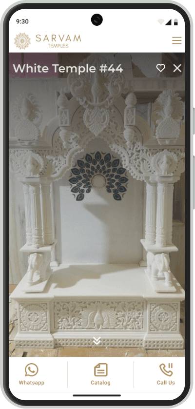
Design an interface that showcases multiple product photos, attracting visitors and reflecting the heritage and service of Sarvam Temple.
Highlighting the temple’s services and craftsmanship in a way that appeals to discerning customers while preserving the essence of its cultural roots.
Challenges
Avoid making a ecommerce website. (Client was completely against it)
Avoid integrating third party payment gateways and yet provide a solution for customers to reach out for enquiries.
Minimised first input delay, ensuring smooth user experience while displaying multiple images.
Designed a photo-intensive interface to showcase high-resolution images of the client’s intricate temple designs.


Typography
For Headings & Titles: Libre Bodoni
Libre Bodoni is a modern adaptation of Morris Fuller Benton’s 19th-century ATF design, tailored for web use. It offers four styles—Regular, italic, bold, and bold italic—making it ideal for projects that emphasise elegance, luxury, and fashion.
For Body: Montserrat
The font revives the urban typography style of the early 20th century, capturing its beauty and character.
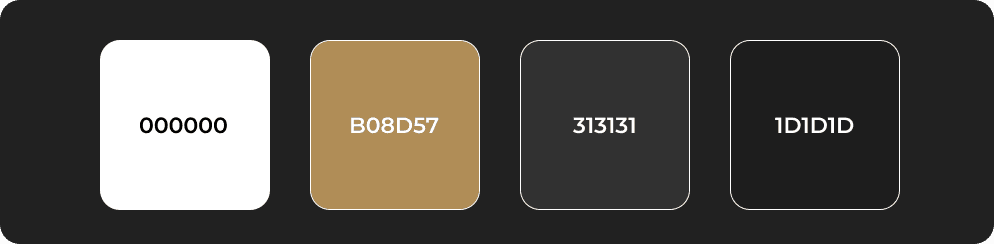
The Colour of Bronze
Bronze is a warm, reddish-brown hue created by blending copper and tin. Known for its richness and luxury, it’s a versatile color that works in both modern and traditional settings. Used since ancient times for its strength and flexibility, bronze carries a timeless quality, evoking elegance and durability in design.

Role & Contributions
Engaged in direct 1-on-1 client interactions at each stage to define project requirements and scope.
I redesigned an interactive digital portfolio, changing the static PDF format.
The design had to incorporate an interface easy enough to use based on the temple's culture.
Designed a new logo that meets the online identity of this temple.
Worked together with developers to design responsible cross-platform capabilities.